Should Reading change our club crest...
-
Whore Jackie

- Hob Nob Regular
- Posts: 3128
- Joined: 09 Feb 2006 13:48
- Location: Over 'ere
Re: Should Reading change our club crest...
28 May 2013 20:51Everton back down! Their new badge will only be used for a year, whilst they consult with their fans for an all-new crest for 2014/15. 
-
Daniel_ElmPark1986
- Member
- Posts: 38
- Joined: 26 Mar 2013 19:31
- Location: Reading,Theale
Re: Should Reading change our club crest...
29 May 2013 09:42i like our crest no need to change it !! But even better then a new crest would be cool if they designed a kit like our elm park 95/96 season with the new sponsors and current crest #Retro

Re: Should Reading change our club crest...
29 May 2013 11:15#youwot #youwot #youwotyouwotyouwotDaniel_ElmPark1986 wrote:i like our crest no need to change it !! But even better then a new crest would be cool if they designed a kit like our elm park 95/96 season with the new sponsors and current crest #Retro
-
soggy biscuit

- Hob Nob Addict
- Posts: 8524
- Joined: 04 Nov 2004 20:29
- Location: BURNING VARIOUS NATIONAL FLAGS
Re: Should Reading change our club crest...
29 May 2013 11:17I don't like our crest
-
Alexander Litvinenko

- Hob Nob Regular
- Posts: 2709
- Joined: 23 Jan 2012 13:58
- Location: Winner - HNA? Music Quiz 2013. The Great Sounds of Polonium 210.
Re: Should Reading change our club crest...
29 May 2013 11:47I don't particular care about it one way or another - it's a badge, that's all.
-
Blue & White Soup

- Member
- Posts: 176
- Joined: 30 Apr 2012 15:48
Re: Should Reading change our club crest...
29 May 2013 12:49in my opinion the badge is good and unique. No need for a change.

Re: Should Reading change our club crest...
29 May 2013 23:20LOL - surely the bare minimum requirement of any club badge is for it to be unique.Blue & White Soup wrote:in my opinion the badge is good and unique. No need for a change.
Although no doubt someone can come up with an example of a division 3 side sharing one with an Argentinian club or something.

Re: Should Reading change our club crest...
31 May 2013 04:31forgot to post this
Re: Should Reading change our club crest...
31 May 2013 13:28erm, Green? what about - 
Other 'Reading' badges..
 [previously]

Other 'Reading' badges..

Re: Should Reading change our club crest...
31 May 2013 20:15Put that crest on a shirt and submit it to the T-shirt contest. I would buy itJayRoyal wrote:forgot to post this
Re: Should Reading change our club crest...
01 Jun 2013 08:10It wont win cause it'd imply there was a new badge, they want other kinds of designs, I'm gonna be making a few in the next weekMike Hunt wrote:Put that crest on a shirt and submit it to the T-shirt contest. I would buy itJayRoyal wrote:forgot to post this
-
reading_fan

-
Hob Nob Subscriber

- Posts: 733
- Joined: 11 May 2004 10:32
- Location: Birmingham
Re: Should Reading change our club crest...
06 Jun 2013 11:52Submit that Puma kit mock up
-
TheWhisper
- Member
- Posts: 66
- Joined: 16 Apr 2012 13:05
Re: Should Reading change our club crest...
02 Jul 2013 16:28Have you noticed the logo that appears on some of the clothing in the shop, it is just the crown from the crest with 1871 under it.
Pretty sure that most people outside of the club wouldn't have a clue what the logo is.
Pretty sure that most people outside of the club wouldn't have a clue what the logo is.
-
JoeyJoeJoeJnrShabadoo

- Member
- Posts: 388
- Joined: 12 Apr 2005 14:42
- Location: Moe's
Re: Should Reading change our club crest...
02 Jul 2013 16:35maffff wrote:erm, Green? what about -
Other 'Reading' badges..
-
SpaceCruiser

-
Hob Nob Subscriber
- Posts: 5590
- Joined: 14 Apr 2004 14:17
- Location: Desperately seeking to return home
Re: Should Reading change our club crest...
02 Jul 2013 18:54I think they changed to this:St. Brynjar wrote:
but possibly fans didn't like it and Roma decided to keep both?!?
Anyway, I quite the current crest, it has grown on me over the years.
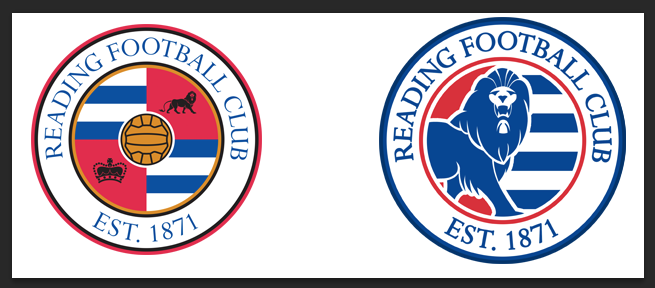
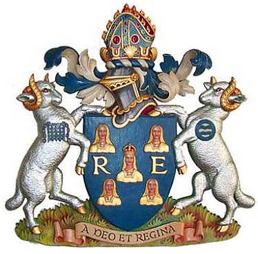
Correct me, but didn't we once have a crest with the merry maidens on it a long time ago? i.e. the five maidens on the shield in this....
EDIT: Oh, I forgot to say that I was wondering whether we could do something on the current crest to show off our 106 point record, how about 106 white dots along the red border?!?
-
Royal Biscuitman
- Hob Nob Regular
- Posts: 1033
- Joined: 23 Jun 2012 18:15
- Location: Anything Else
Re: Should Reading change our club crest...
02 Jul 2013 20:22Why don't we have more than one club crest? - Is there something in the rules against it?
-
Royal Biscuitman
- Hob Nob Regular
- Posts: 1033
- Joined: 23 Jun 2012 18:15
- Location: Anything Else
Re: Should Reading change our club crest...
02 Jul 2013 20:24And two Championship Stars above the badge... obviously, with room to add a 3rd towards the end (and we'll take them all off next season).SpaceCruiser wrote:EDIT: Oh, I forgot to say that I was wondering whether we could do something on the current crest to show off our 106 point record, how about 106 white dots along the red border?!?
-
HoneyRoastHoax

- Hob Nob Regular
- Posts: 1228
- Joined: 07 Mar 2012 09:22
Re: Should Reading change our club crest...
10 Jul 2013 16:10Those Iraqi's have great crests for their teams

-
Royal Biscuitman
- Hob Nob Regular
- Posts: 1033
- Joined: 23 Jun 2012 18:15
- Location: Anything Else
Re: Should Reading change our club crest...
10 Jul 2013 17:34Good.TheWhisper wrote:Have you noticed the logo that appears on some of the clothing in the shop, it is just the crown from the crest with 1871 under it.
Pretty sure that most people outside of the club wouldn't have a clue what the logo is.
-
sandman
- Hob Nob Super-Addict
- Posts: 12449
- Joined: 01 Oct 2008 18:25
- Location: Slaughterhouse soaked in blood and betrayal
Re: Should Reading change our club crest...
12 Jul 2013 19:17We should definitely change the wording to say "established 2005" for the likes of Roy911, winchy_baby and the Avon Lady who want to forget where we came from and who we are.
Who is online
Users browsing this forum: Baidu [Spider], Semrush [Bot] and 5 guests
It is currently 03 May 2026 11:32